What do Baystate Blue, Bambi, kittens, and Smokey Bear have in common? Let’s find out!
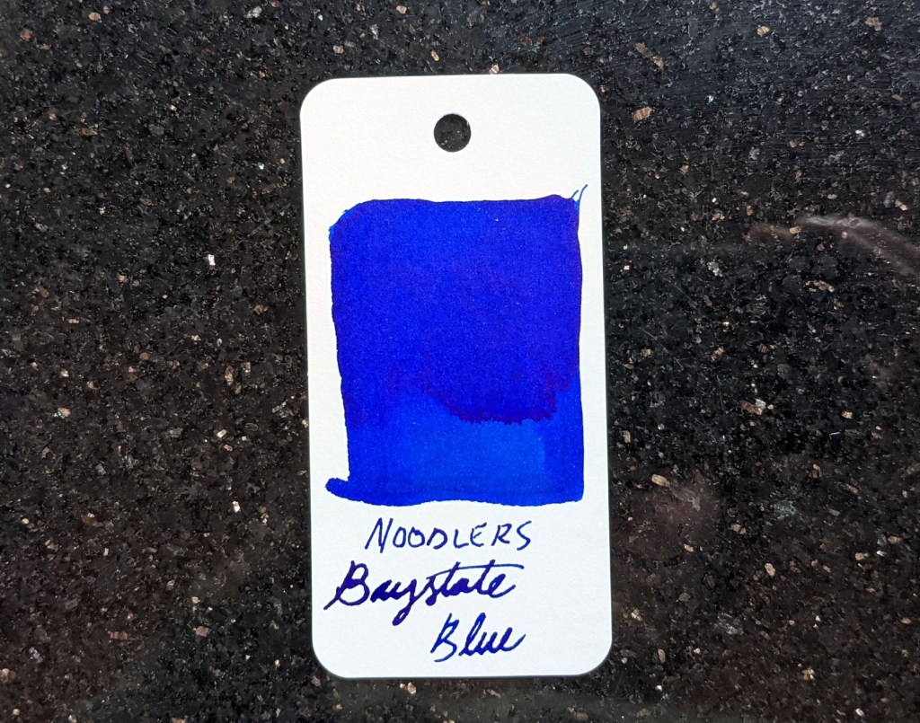
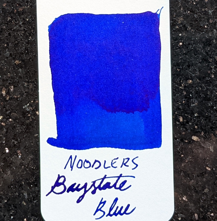
The most infamous Noodler’s ink is Baystate Blue. It’s so infamous that it has its own Reddit user account. BSB is an intensely saturated ink that will stain whatever pen you put it in, and is water and forgery resistant. This ink has a higher pH level than other modern inks, and can only be mixed with other Baystate inks. I wondered why an ink like BSB exists, so I did some research and found that Baystate Blue is a recreation of a particular Carter’s ink from the 1940’s.

Carter’s Ink was based in Boston and was, at one point, the biggest ink manufacturer in the world. Starting in fall of 1941, Carter’s made an ink called American Blue. In the spirit of patriotism, American Blue was based on inks used in Colonial times. It was a vibrant blue, and the bottle had an eagle on the label. An ad for American Blue touts the oval shaped bottle as “streamlined” and “packaged in the mood of the times”. I’m guessing that the streamlining of the bottle has something to do with the lingering economic effects of the Great Depression. Perhaps the oval bottles used less glass but could hold the same amount of ink as their other bottles. Carter’s regular bottles were cube shaped like modern Sailor bottles, and had really neat labels:
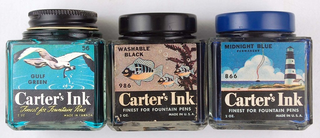
The link above is to a post on Munson Pens called “The Story That Your Ink Bottle Tells”, which takes a look at a promotional book for Carter’s of the same name. This post also looks at Carter’s ads and bottles. A Carter’s ad not included in that post is this one:

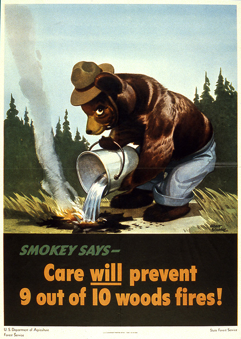
Carter’s kittens, because these inks are gentle as a kitten. This is a great ad, and the art was done by Albert Staehle. He did many advertising illustrations, as well as some Saturday Evening Post covers and some work for the WPA (Works Progress Administration) Federal Art Program. He is most known for art of various animals including dogs and Elsie the cow for Borden’s Milk.
In August of 1942 Disney released its masterpiece of animation, Bambi. It’s the story of a young deer growing up in the forest. During World War Two, the U.S Forest Service started using wildfire prevention campaigns as a form of propaganda. There were less men around to fight wildfires, and the government was actually concerned that the Axis powers would use wildfire as a mainland attack strategy. Because of Bambi’s hard-hitting message of conservation, Disney allowed for Bambi-inspired characters to be used in a 1943-44 Forest Service fire prevention ad for one year.

Around the same time as the above ad, the Forest Service ran a handful of fire prevention posters by WPA artists. The poster below was created by Albert Staehle, and seems Bambi-inspired as well. In 1944, the Forest Service needed a new animal mascot for when their license expired, so they asked Staehle to design a mascot. He created Smokey Bear, the American icon of the forest.

If Bambi has a similar look to these WPA style posters, that’s because the look of the film was designed by a different WPA artist named Tyrus Wong. Wong’s art style was inspired by Chinese art from the Song dynasty. Bambi has a pretty naturalistic color palette, so I wasn’t sure if an intense blue like BSB could be found in the film, but it is:
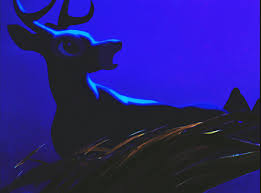

The first frame is from a stylized fight scene, and is the closest shade to Baystate Blue. At the top of the second frame in the right hand corner, and in some spots in the stream, you can see BSB as well in its lighter shades. Bambi has lots of blue, but it’s either a darker blue or more of a blue-green.
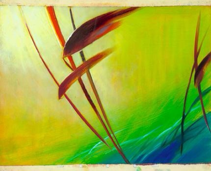

Above are two of Wong’s works. On the right is a mural titled Dragon Chasing Pearl from 1941. This mural was for the Federal Art Program for a bank in Los Angeles. You can see shades of Baystate Blue on the dragon and in the clouds. On the left is concept art for Bambi, and you can see some BSB in the bottom right hand corner.
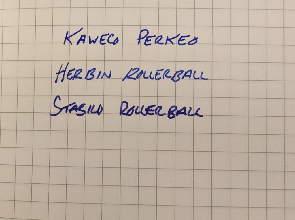
Baystate Blue writes silky smooth. I put this ink in a J. Herbin rollerball to test it out, and it’s actually a very nice rollerball ink. The Herbin rollerball needs a wet, lubricated ink to make writing with it at all pleasurable, and BSB does the job. I used a blunt-tipped syringe to fill an empty cartridge. I can normally do this without making a mess but this time I overfilled the cartridge and got ink on my fingers.
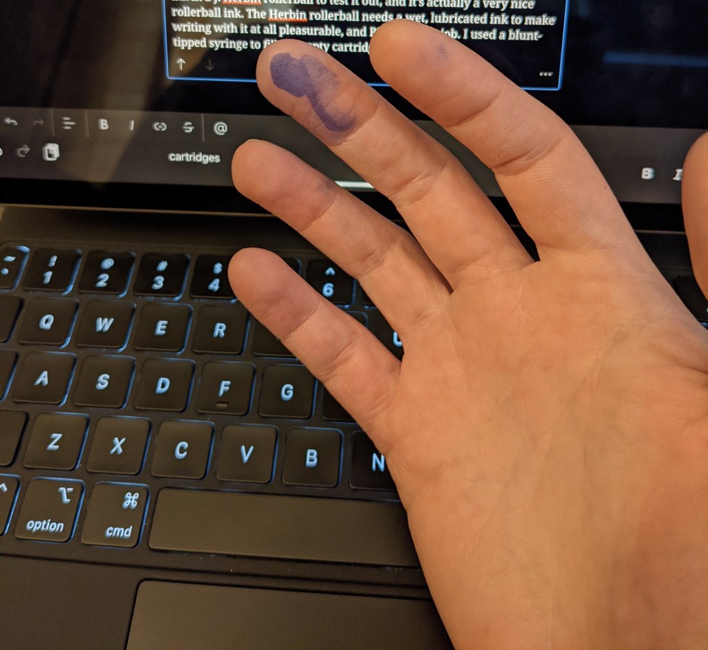
I also put Baystate Blue in a Kaweco Perkeo, which offers a much better writing experience than the Herbin rollerball. The tops of my hands are now dotted with blue ink, but I know it’ll come off with a lot of washing. The color of this ink reminds me of the bright blue ink that’s in Stabilo rollerballs, and is definitely unique among fountain pen inks. While I enjoyed using Baystate Blue, I most likely won’t purchase a whole bottle of it because of the staining issues.


Leave a comment