
Let’s expand the NCU with Noodler’s Q’ternity, a fast drying dark blue ink. Q’ternity is part of the Bernanke series, which consists of bulletproof and fast drying inks in office appropriate colors. Ben Bernanke was head of the US Federal Reserve during the Bush and Obama presidencies, and during the 2008 financial crisis. The Bernanke bottle labels are very cryptic with currency and highlighter. These inks are fast drying because the Fed needs quick dry ink to print all that cash.

The label on the Q’ternity bottle is a bit different as it has the $100,000 bill on it. This particular bill has Woodrow Wilson on it, the racist yet progressive 28th president of the United States. Wilson signed into act the Federal Reserve, began collecting income tax, and he led the US through World War I. His left eye is circled to make him look like he has a black eye, and all the zeroes are slashed through so that there are only ones. I’m sure that the black eye is Nathan Tardiff’s comment on the Fed and income tax. The word “gold” is crossed out and QE3 has been added next to it.
QE3 stands for the third phase of quantitative easing. Quantitative easing is where a central bank will purchase government bonds in order to inject money into an economy to try and boost growth. This has been used in the US during the Great Depression as one of many recovery tools, and during the 2008 financial crisis. Quantitative Easing is similar to how war bonds work, except with war bonds it’s the public purchasing the bonds and not a bank. The money earned by the government from war bond sales helps fund defense production. This was first introduced in World War I by Wilson and were called liberty (or defense) bonds. Bond sales were boosted by propaganda and rallies. These rallies sometimes included movie star appearances. The United States did this again in World War II, using more intense propaganda and the full power of the new Hollywood machine to sell more bonds. Different genres of movies became geared to potentially influence a variety of demographics.

There has only been one movie made about Woodrow Wilson, and that is Wilson (1944). It’s about the life of Woodrow Wilson from his time as dean of Princeton to his presidency. The second half of this two and a half hour long movie is focused on Wilson’s struggle to form the League of Nations, a precursor to the United Nations. This movie has been largely forgotten today, and it does not hold up well. In its time though, Wilson won several technical Academy Awards and did well at the box office. Wilson had otherwise made his mark on film history by calling 1915’s controversial The Birth Of A Nation, “History written with lightning”.
Q’ternity is the color of many of the suits in Wilson. It’s the color of the studio manufactured moonlight on a White House balcony. It’s the color of some velvet sitting room chairs. It’s the color of the blue stripes on the American Flag, and many signs. It’s also the color of the oval office. There’s a scene that’s just Wilson signing laws and acts, and the ink looks like Q’ternity.


The production of Wilson by 20th Century Fox and Darryl F. Zanuck is more interesting than the film itself, and this production had a lot riding on it. At the time, it was the first movie to feature living historical figures, and it was the most expensive film at Fox to that date. It premiered during an election year, and there were concerns that Wilson would be considered Roosevelt fourth term propaganda. The film studios mostly felt (at least outwardly) that it was their duty to provide escapist fare for audiences, but they also knew how much power over audiences they could wield. Propaganda movies, or movies that were made to influence public opinion, became more prevalent during World War II, and Wilson can be included among the most heavy handed of its era.
Zanuck got the approval of Wilson’s surviving family and political associates at every step of the production process, and even had a Wilson scholar look at the script. A Technicolor film was expensive to make, so it needed to be able to turn a profit. Zanuck worried that Wilson would only appeal to intellectuals, so the movie was made in Techicolor and promoted as an important epic, a film to prevent the next world war.

A studio could never own a Technicolor camera; they had to be leased from the Technicolor company. Along with a giant camera came a special Technicolor cameraman and a color director named Natalie Kalmus. Kalmus supervised every Technicolor movie from the mid 1930’s through the late 1940’s. She and her team would meet with directors, costume designers, set designers, and art directors to understand the appropriate color mood for the film. They would then make a “color score” for the movie, outlining the colors that should be used or emphasized in order to evoke a certain mood to the audience. According to Kalmus in her essay titled “Color Consciousness”, the use of blue was meant to convey truth, calm, science, and hope. This is used generously in the White House set, and Wilson’s home set. With such an uneasy political climate, using as much blue as tastefully possible was a way to subversively bolster the audience’s faith in its appointed leaders.

The blue of the White House set shown above looks more like Baystate Blue, which is interesting considering that BSB is a recreation of Carter’s American Blue that was released in 1941. It’s a true cinematic universe when a character makes multiple appearances. The American Blue bottles had a flying eagle on them, and around 1943 or 1944, were made into V-Mail inks. V-Mail inks had to have certain properties so that letters written with them could be transposed to microfilm. Noodlers has a V-Mail series, and I plan to post about them sometime in the future. American Blue was a distinctly patriotic ink, and the near-monochromatic White House set stands out among the other more standard and period appropriate sets in Wilson. This movie won the Academy Award for best color set design.


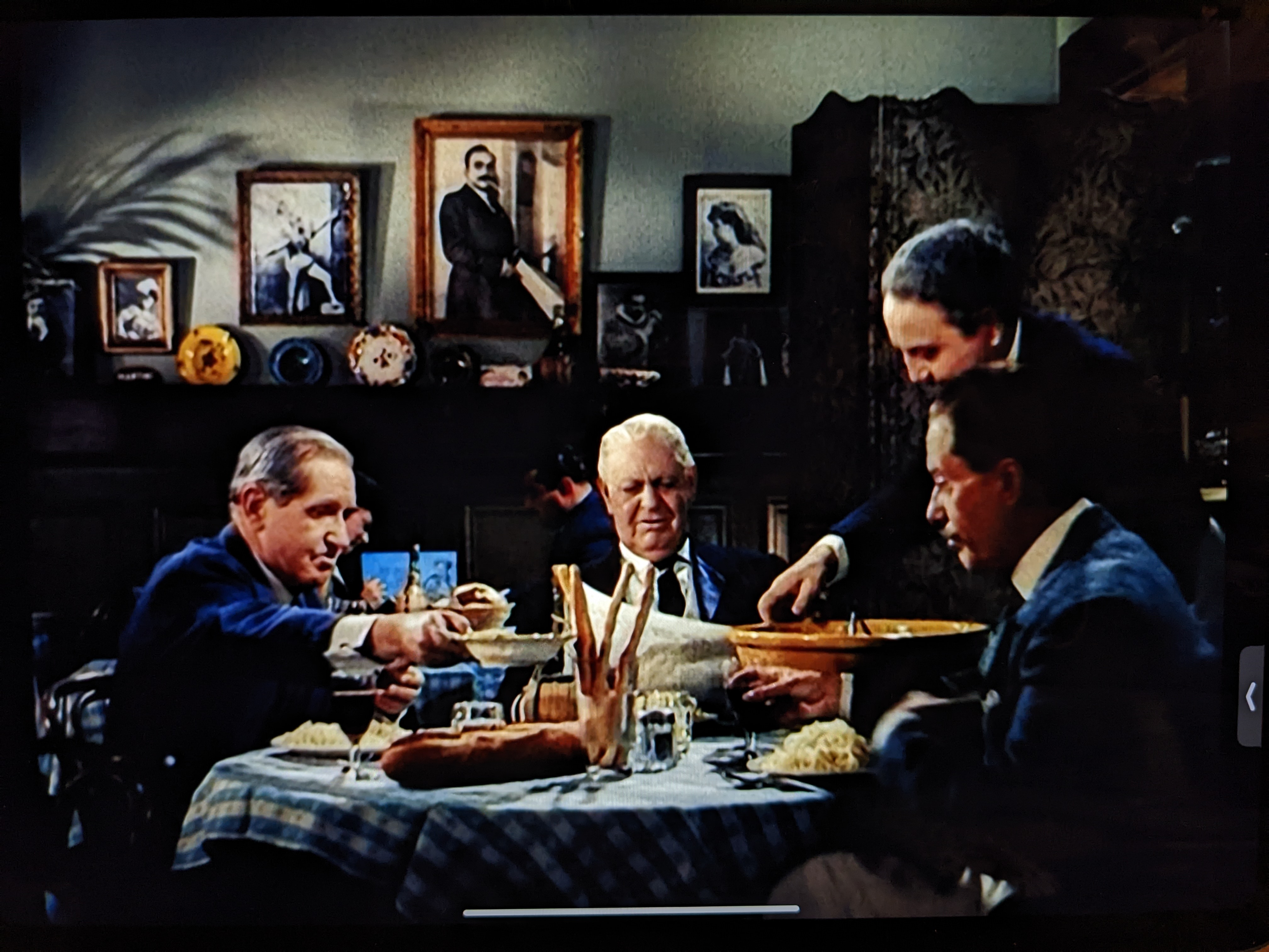

There are a lot of blue suits in Wilson. The blue suits are a big deal because all of the important political movies that came before Wilson were in black & white. This includes Citizen Kane (1941), Mr. Smith Goes To Washington (1939), and the actual government sponsored WW2 propaganda short film series called Why We Fight. It’s difficult to tell how politicians dressed in the 30’s and 40’s because there are few color photos, or black & white photos have been colorized. Today, many politicians wear navy suits with a white shirt and a red or blue tie. The overall color scheme is of course patriotic, authoritative, and represents calm stability. Coincidentally, the last three presidents have worn a navy suit with some kind of blue tie for their presidential portrait. Because Wilson is the first Hollywood live action political feature film in color, I wonder if this movie had some kind of effect on political fashion in the second half of the 20th century.

As an ink, Q’ternity is pretty great. Unlike most Noodler’s inks, Q’ternity actually dries and hasn’t smudged for me while overwriting. I originally had this ink in my Desiderata BAMF with a 0.6 mm stub, and it always flowed well. That pen writes wet, and this ink still dried in a reasonable amount of time. Q’ternity sheens a little bit, and shades nicely especially with a thick line. On Goulet Pens the Bernanke series is recommended for lefties. Q’ternity is the only ink in this series that I’ve tried, but they might be the only Noodlers inks that lefties can functionally use. This ink lubricates your nib and makes writing left-handed smooth and pleasurable.
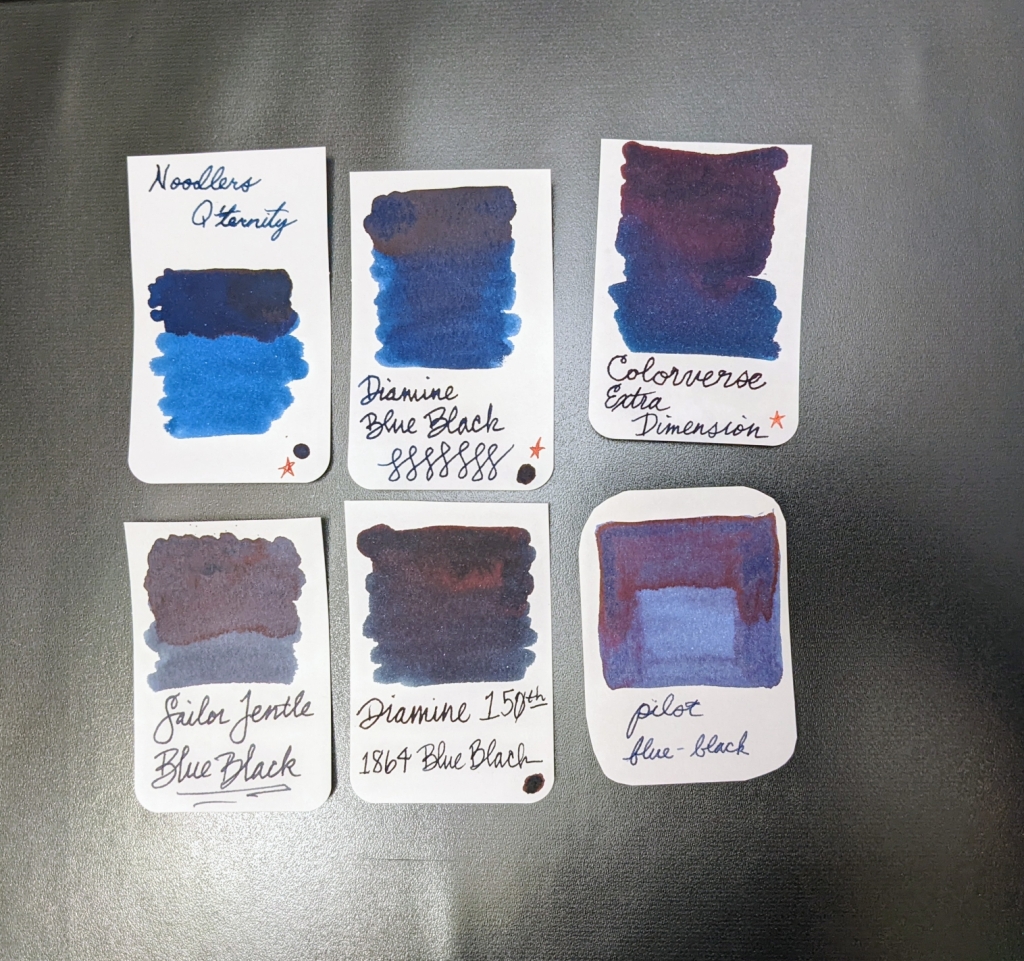
Earlier, I called Q’ternity a dark blue ink because it’s indeed bluer than other blue-blacks. I realize now that there are two types of blue-blacks: dark blue, and blue-grey. Q’ternity sheens less than the blue-blacks pictured above, and the contrast between its lighter and darker shades looks more stark. It’s a beautiful ink, and is a good option if you’re looking for a blue-black that’s fast drying, waterproof, fade-proof, and shades. Q’ternity is available at most pen/ink retailers in very full 3 ounce bottles. Next time on the Noodlers Cinematic Universe: Black Swan in Australian Roses.
12/16/22 Editor’s Note:
Noodler’s Q’ternity has been renamed to Brevity Blue-Black post what one Reddit user has called Noodlegate ’22. Nathan Tardiff released two inks last June with some grossly offensive labels and there was backlash. Goulet even temporarily stopped carrying Noodler’s ink (and they really love Noodler’s). Shortly after this, Tardiff issued an instapology and released a list of renamed inks that previously could have been seen as offensive. One of these was the Bernanke series, now called the Brevity series. The new name makes a lot more sense, since the series is supposed to be fast drying.

Leave a reply to Margret puts pen to paper Cancel reply